Condé Nast
Condé Nast Traveler
UX and UI design across article templates and browsing journeys, improving content discovery and engagement.

I started the project by conducting an IA audit of exisiting content. This would clarify the depth & type of content available to factor into an updated experience.
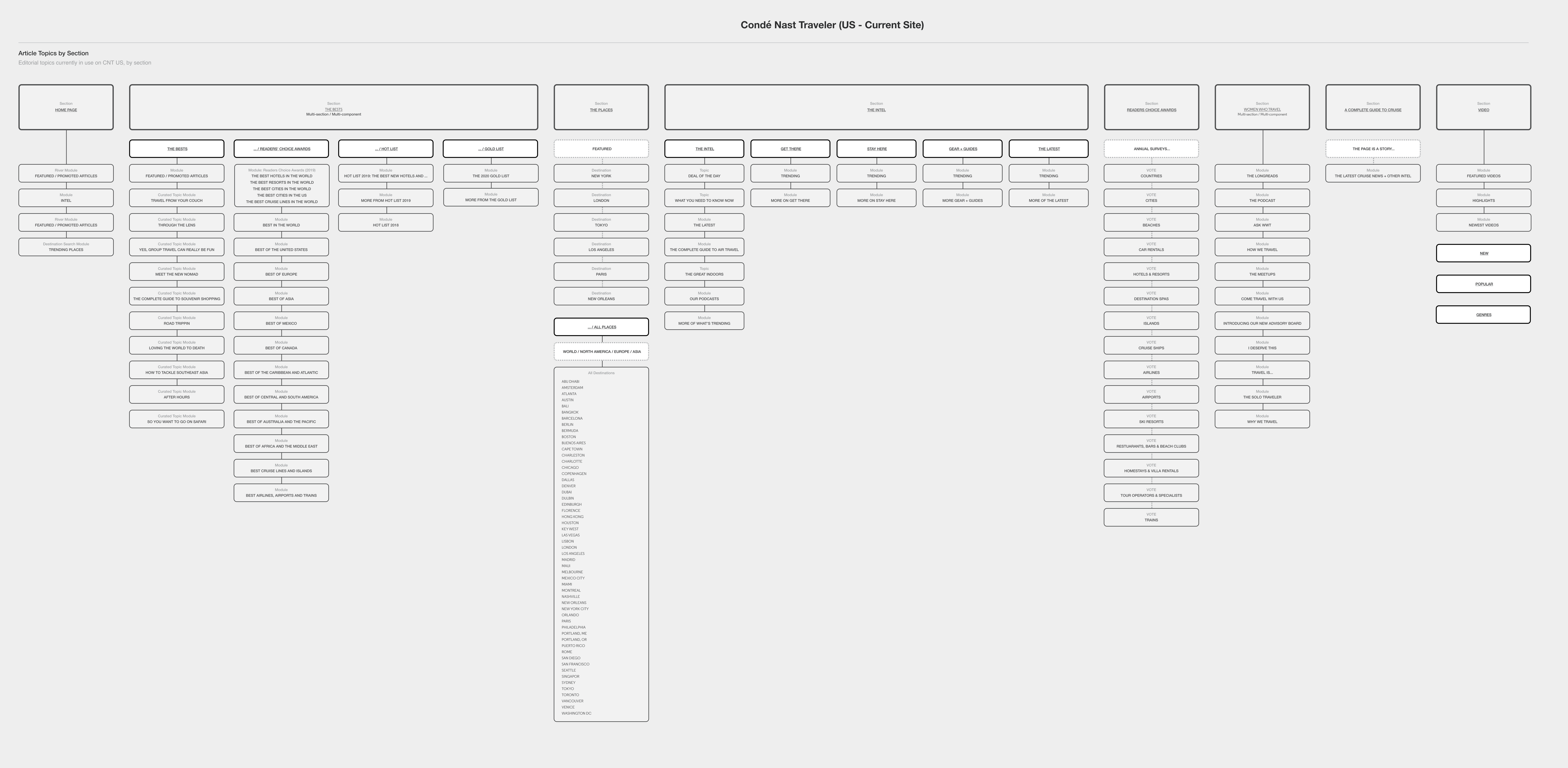
I then mapped out the depth of content from macro to micro regions. This then went on to determine the type of destination pages, mapping major to minor coverage. This went on to determine the structure of destination based pages.

With a clear foundation established, I then produced a clear, consistent page structure for macro through to micro level destination pages. This enabled the user to be guided from top level region pages, through to specific destinations.
Once a user was engaged in a specific location, actionable content such as 'Where to stay', 'Where to eat and drink' and 'What to do' is presented to the user to provide actionable outcomes.

The editorial and ite purpose was to enage with users before and during their trip. CNT would serve as both inspiration, a shopping channel, a booking funnel, and a travel guide whilst they are on their holiday.

This project co-incided with a massive drive across all of Condé Nast, to migrate all Condé Nast brands from all markets, onto a single platform (Verso).
This was a huge 'unification' project - where many components would be made available to all Conde Nast websites. I created the 1st 'mega menu' for Condé Nasts brands on the new platform. So although fairly basic, this was an important leap for Conde Nast for general content 'discoverability'.


I completely revamped CNT (US) Destination pages, together with surfacing and redesigning the hotel review and booking pages.


